
The public’s window into recovery progress
A responsive transparency platform bringing together financial data, project progress, education, procurement visibility, and public accountability.
I’m Aneesha Watve. I frame product opportunities, structure complex systems, and translate strategy into clear experiences that teams can build and people can understand.
Three case studies show how I connect research framing, product strategy, information architecture, and experience design.
A responsive transparency platform bringing together financial data, project progress, education, procurement visibility, and public accountability.
A connected dashboard, mega menu, assistant, and visual system designed to help power users act without losing context.

An end-to-end concept connecting positioning, brand identity, mobile product design, and campaign execution.
A rebranded public window into Puerto Rico’s recovery—combining complex financial data, project progress, educational content, procurement visibility, and accountability in one responsive experience.
Visit the Transparency Portal ↗I treated the Transparency Portal as an information-clarity problem, not only a dashboard problem. The process connected audience needs, recovery terminology, content hierarchy, visual trust, and data interaction into one public experience.
I began with the questions different audiences bring: Where is the money going? What is happening near me? Which agency or program is responsible? What stage is a project in?
I organized disasters, programs, finances, contracts, documents, and project details around those public tasks—using plain-language pathways before exposing deeper data.
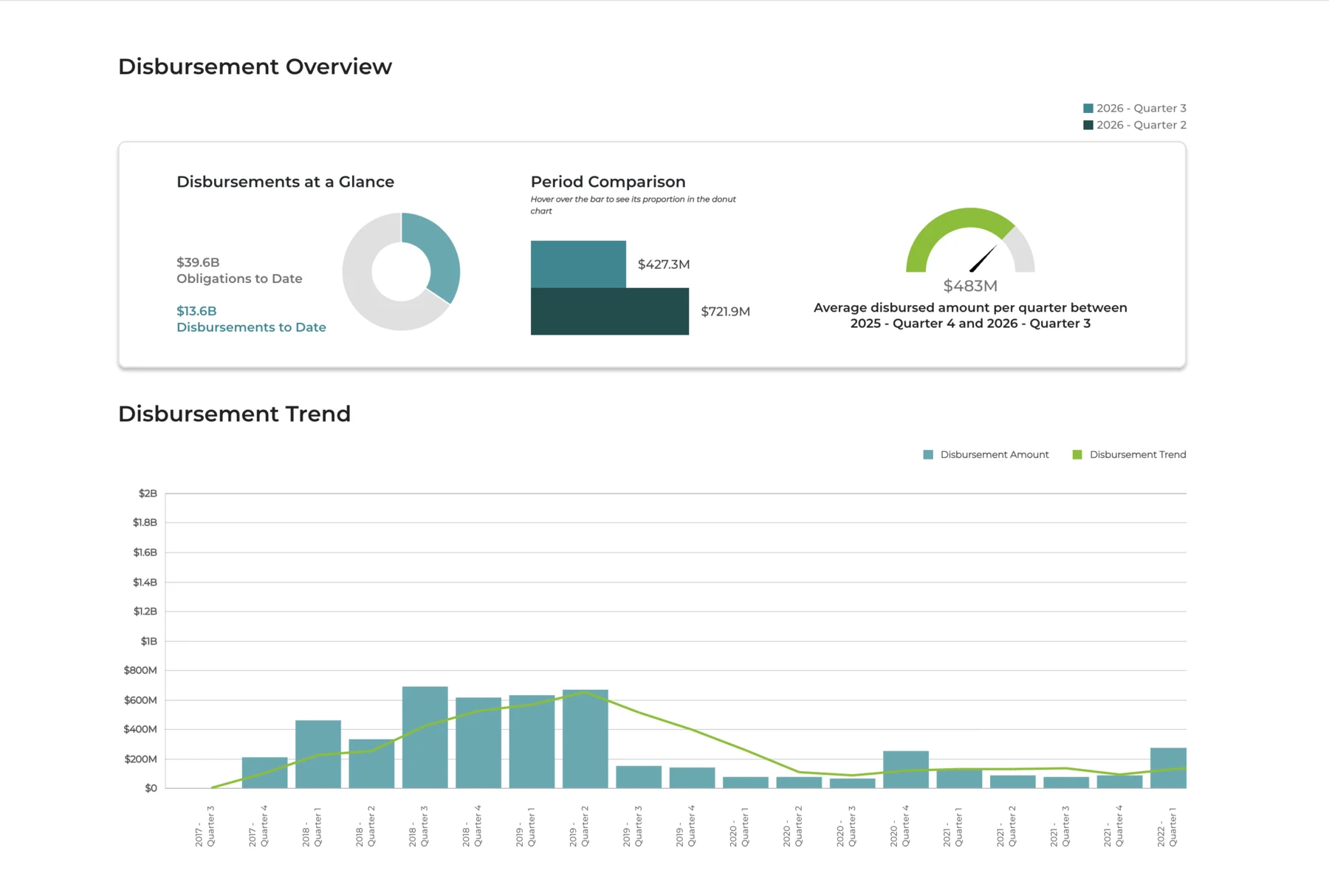
I translated funding totals, disbursement trends, project stages, maps, and agency relationships into consistent visual patterns with context, labels, and drill-down paths.
I used wireframes and clickable flows to test navigation, filtering, terminology, and comprehension, then refined the interface in collaboration with delivery teams.
Because recovery information evolves, the solution included reusable content patterns and a tailored CMS. The design could expand to new disasters, programs, documents, and reporting needs without rebuilding the experience from scratch.

Product direction came from connecting stakeholder evidence, observed behavior, and patterns from comparable civic platforms.
Surface policy, operational, and public-information constraints.
Understand how recovery teams find, interpret, and act on information.
Benchmark civic-data patterns for transparency and comprehension.
The map connects each customer question to a specific friction point and product response.
“Can I trust this source?”
Official information can feel dense and fragmented.
Clear authority cues and a plain-language portal introduction.
“What applies to my community?”
Large financial datasets are difficult to interpret.
Guided filters by place, disaster, program, and agency.
“What evidence supports this?”
Documents and technical terms interrupt understanding.
Progressive detail, concise summaries, and visible sources.
“What can I do next?”
Download, reporting, and follow-up paths may be unclear.
Explicit actions for exporting, sharing, reporting, and returning.
Move people from a broad public question to plain-language context, then progressively reveal the detailed evidence needed to verify it.
These audience models translate the project framing into design priorities. They are portfolio artifacts—not claims about named research participants.

Needs: infrastructure status, trusted emergency information, and local recovery context.
Design implication: clear source cues, place-based navigation, and plain-language summaries.

Needs: grants, eligibility guidance, application steps, and relevant program updates.
Design implication: task-led navigation, guided filters, and visible next actions.
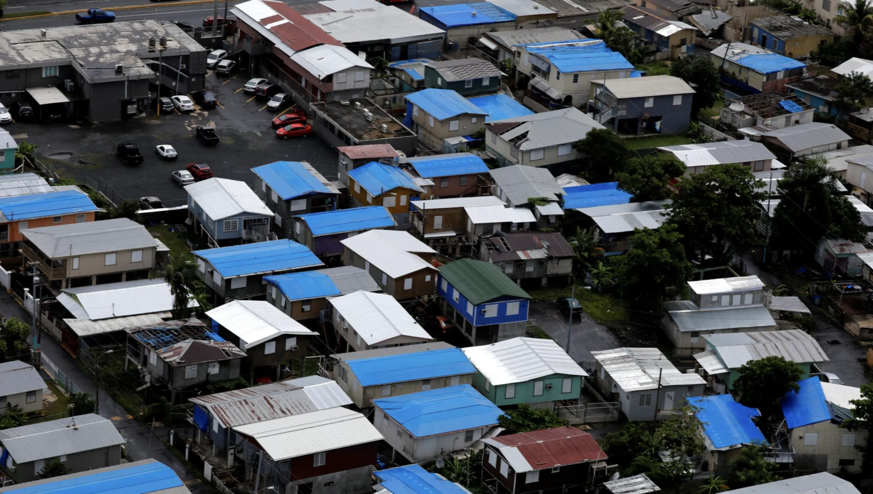
After Hurricanes Irma and María, Puerto Rico faced a long, expensive recovery across damaged power, water, communications, and basic services. Public trust depended on making government-led recovery activity transparent, understandable, and accessible.
The redesigned portal brought together financial data and descriptive content so the public could understand how funds were obligated and disbursed, how projects moved through recovery, and where to find procurement and accountability information.
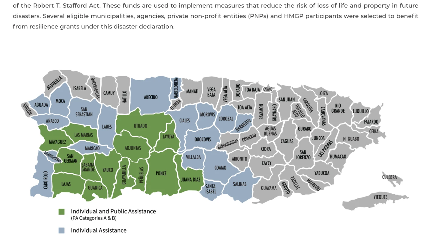
The experience was designed for desktop, tablet, and mobile and supported major browsers. Flexible tables, custom visualizations, an island-wide financial map, and project-stage diagrams made recovery information easier to explore.
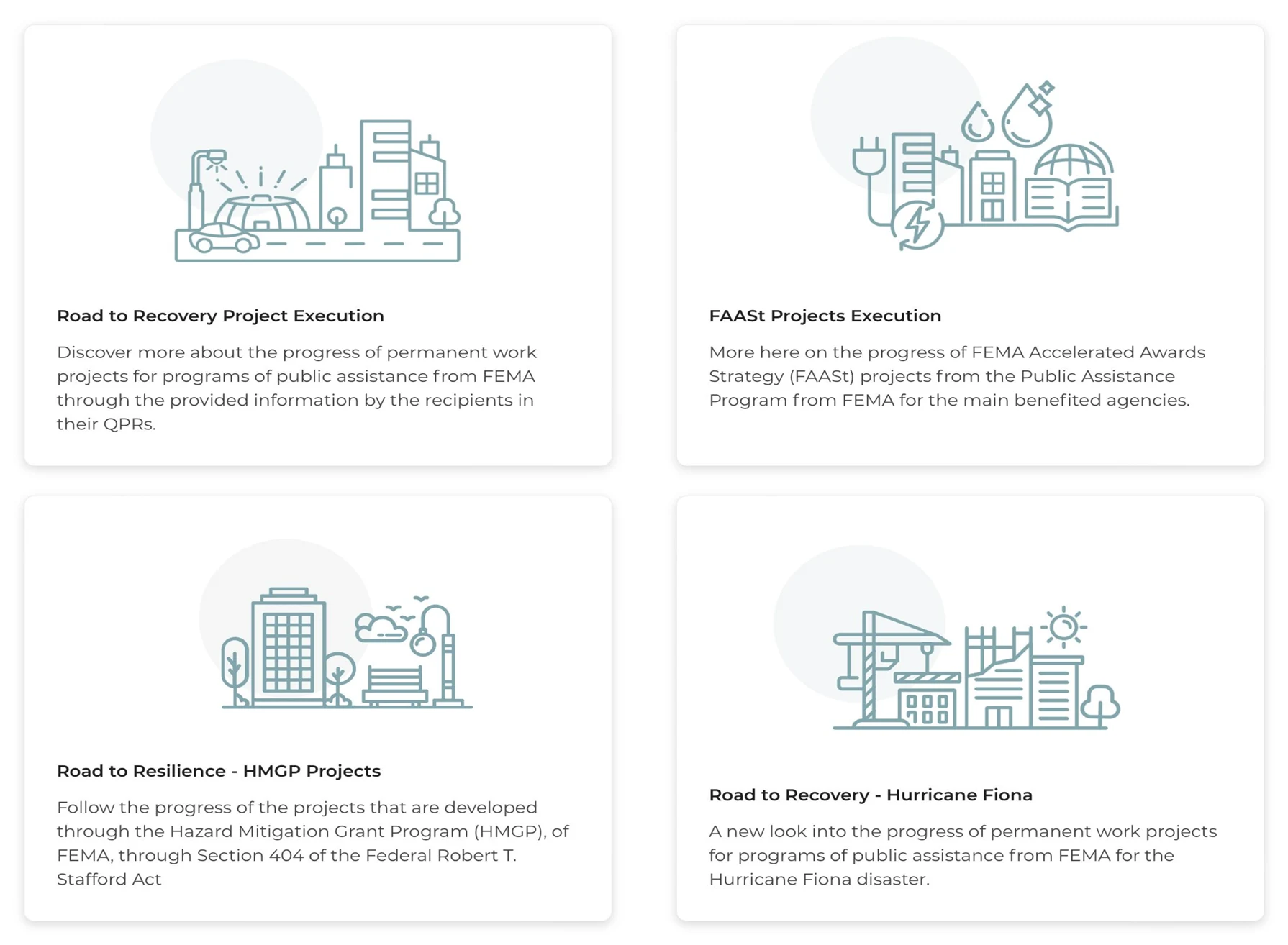
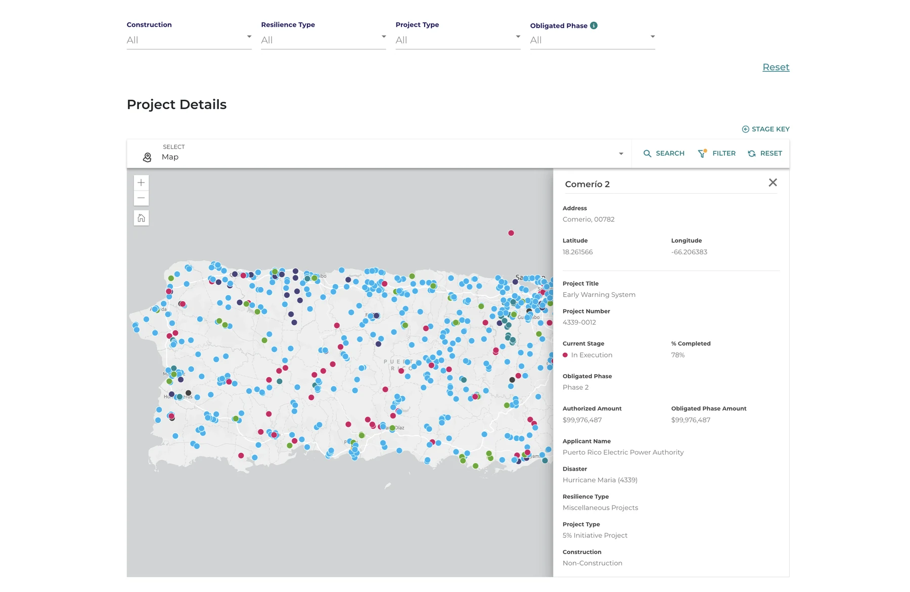
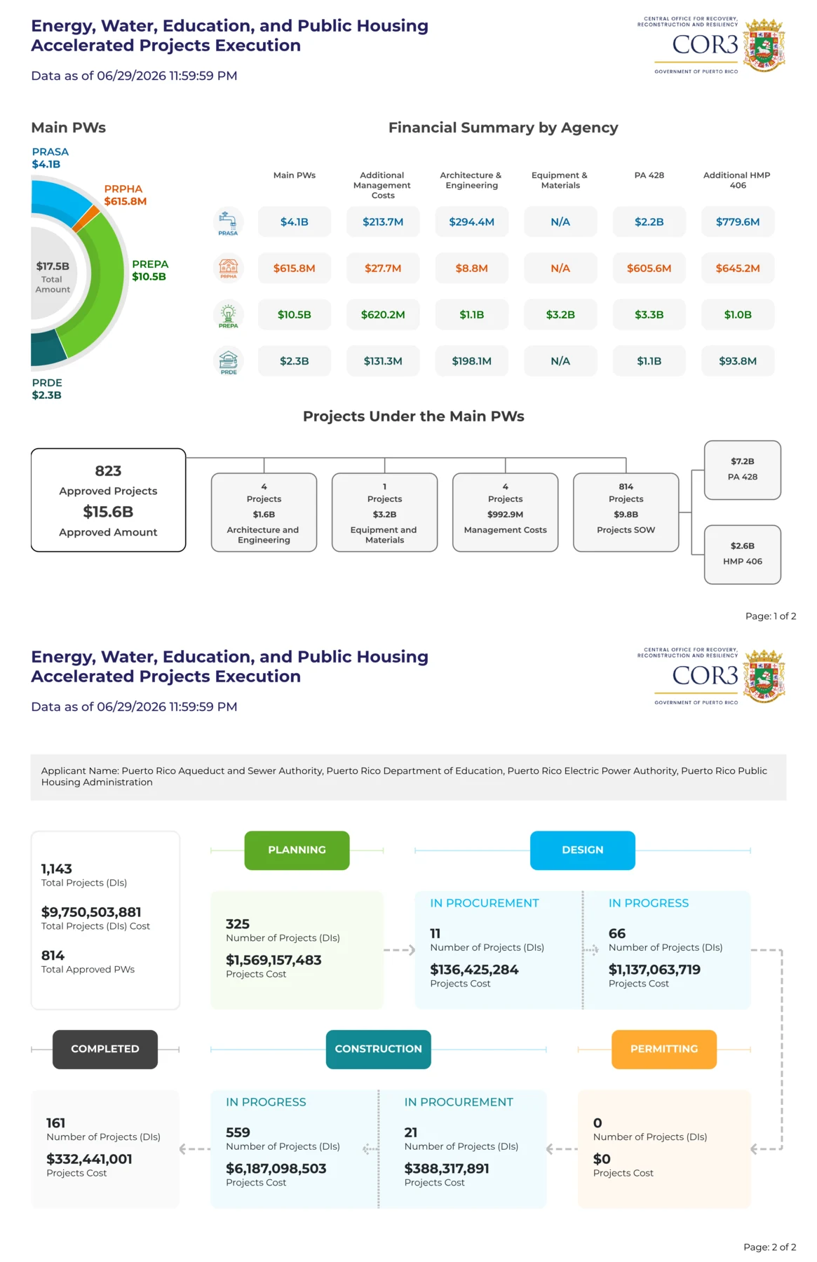
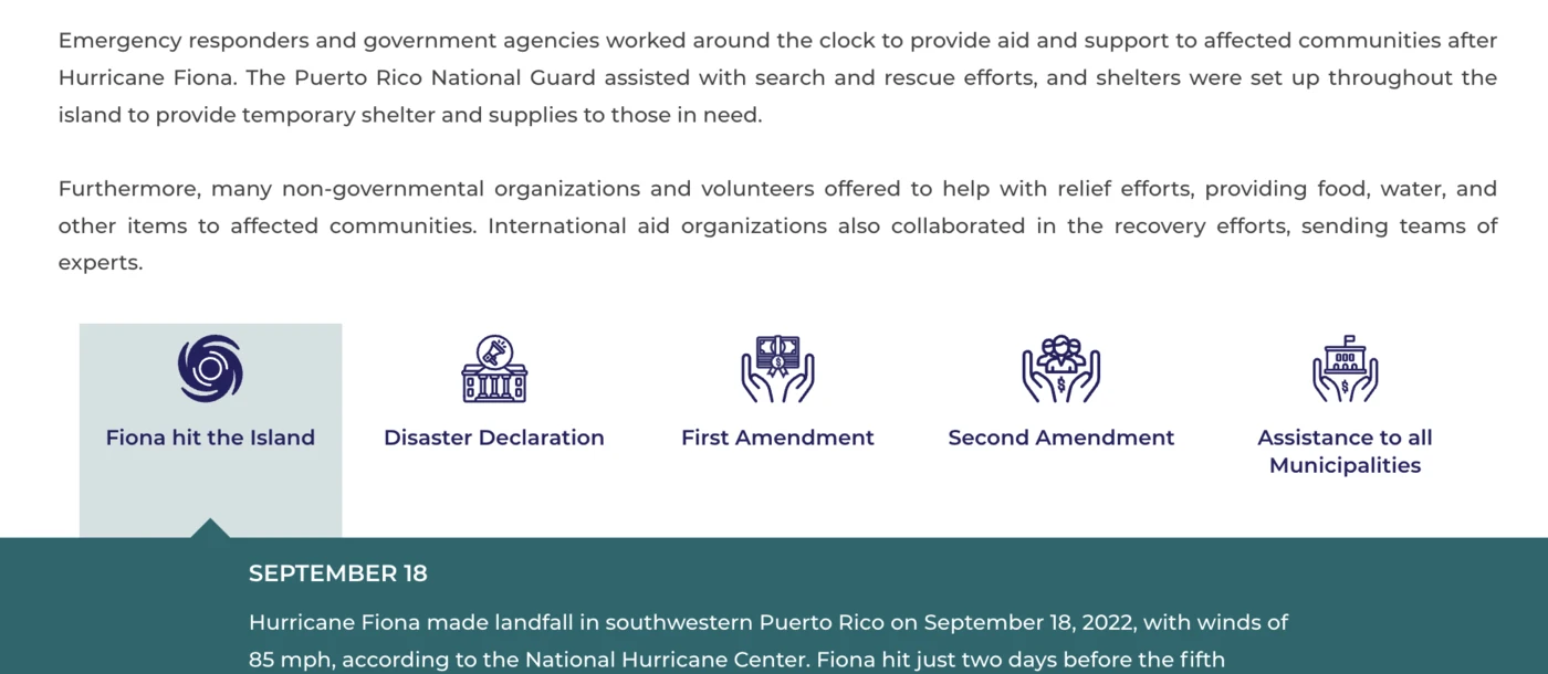
The tailored content management system allowed teams to create, edit, and publish pages, images, and video without specialized technical knowledge. It included a searchable document library, reusable content cards, FAQs, interactive flow diagrams, newsroom publishing, and a public glossary.
According to the supplied case study, since the 2018 launch the number of non-FEMA Federal Recovery Fund metrics increased by 175%, while FEMA Recovery Fund metrics increased by 325%.
The portal later expanded beyond Hurricanes Irma and María to include content and data related to earthquakes, the coronavirus pandemic, and Hurricane Fiona—making the content architecture’s adaptability part of the product value.
The case study attributes four broader benefits to the platform: increased transparency into public spending, better-informed public decision-making, enhanced accountability through visibility, and more streamlined recovery and procurement processes. These are presented as documented case-study outcomes rather than independently audited causal findings.
A coherent operating layer for a complex recovery platform—helping power users orient, navigate, understand, and act without losing context.

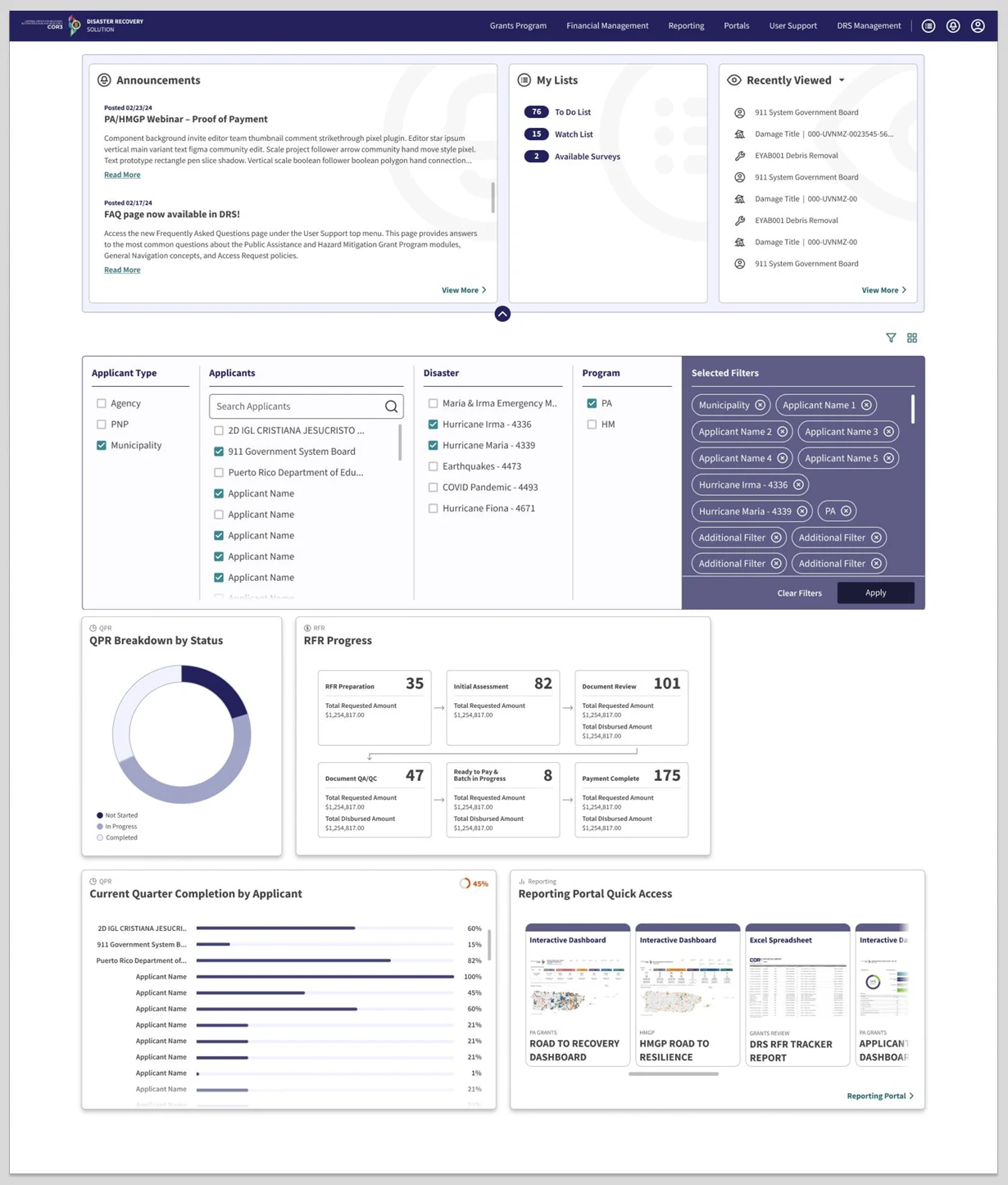
Announcements, personal lists, recent records, global filters, progress widgets, and reporting shortcuts create a sequence from orientation to action—not a random collection of cards.
Grouped navigation makes grants, finance, reporting, portals, management, and support legible as one product suite. The menu teaches the system’s structure while respecting roles and permissions.
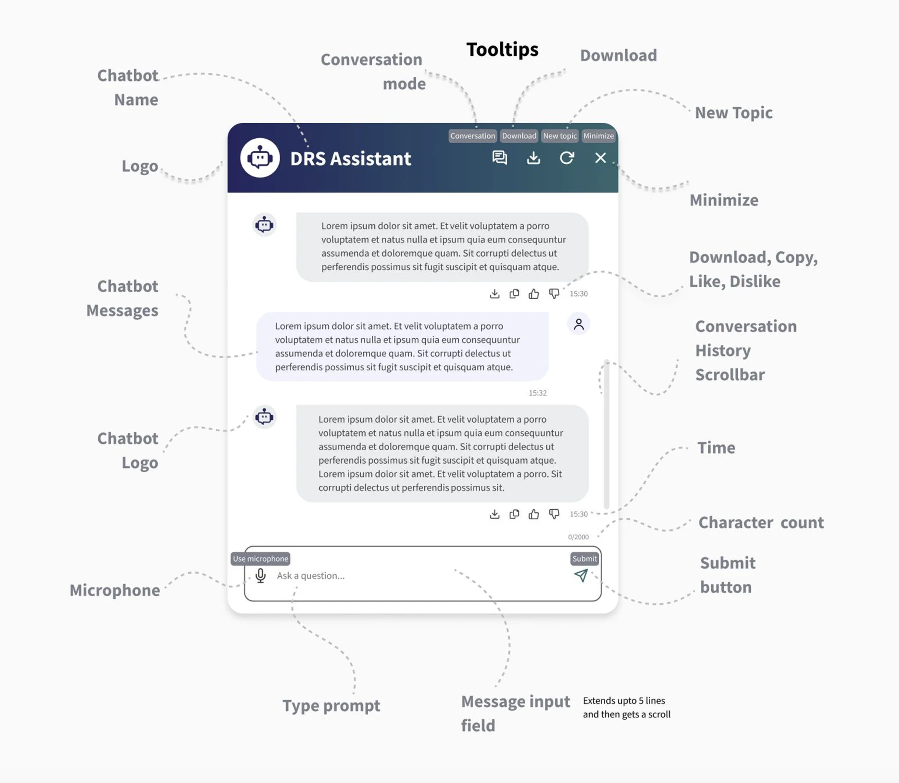
Conversational help stays inside the workflow. It can explain terminology, navigate to the right module, summarize visible information, and guide next steps while preserving source and permission boundaries.
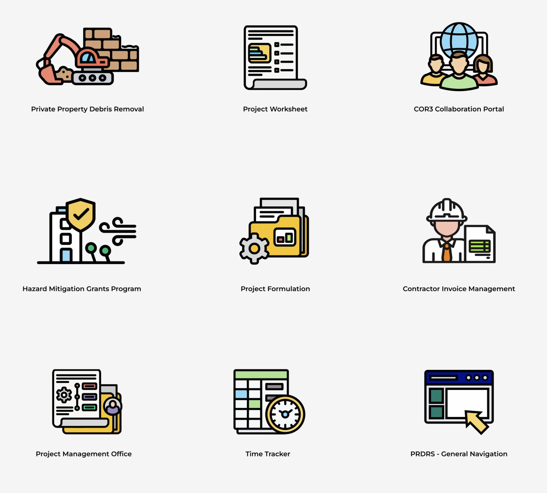
Feature illustrations support orientation; functional icons support repeated interaction. Both reinforce explicit labels, consistent metaphors, accessible names, and stable category colors.
A connected concept, brand, product strategy, and execution system centered on one behavioral goal: making healthier eating easier to sustain.

Healthy intent breaks down under time, budget, knowledge, variety, and consistency constraints. The product was conceived as a lightweight decision system—not only a delivery interface.
Personalized, nutritious meals made convenient enough to become part of everyday life, supported by transparent information and flexible control.
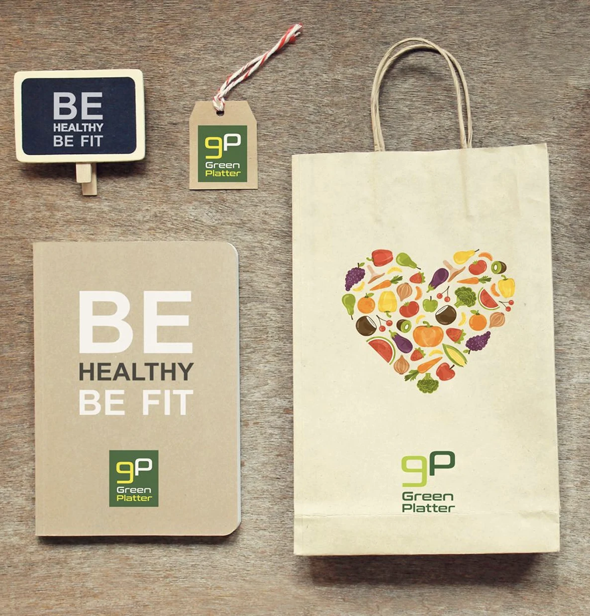
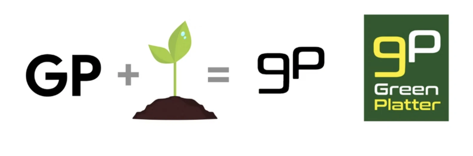
The GP monogram and sprout metaphor communicate growth, freshness, and food. Deep green adds trust; yellow-green brings energy; food imagery proves appetite and variety.
Relevance, transparency, convenience, enjoyment, and adaptation form the value pillars. Advanced personalization waits until the core loop—good meals, clear information, reliable delivery, easy repeat ordering—proves itself.
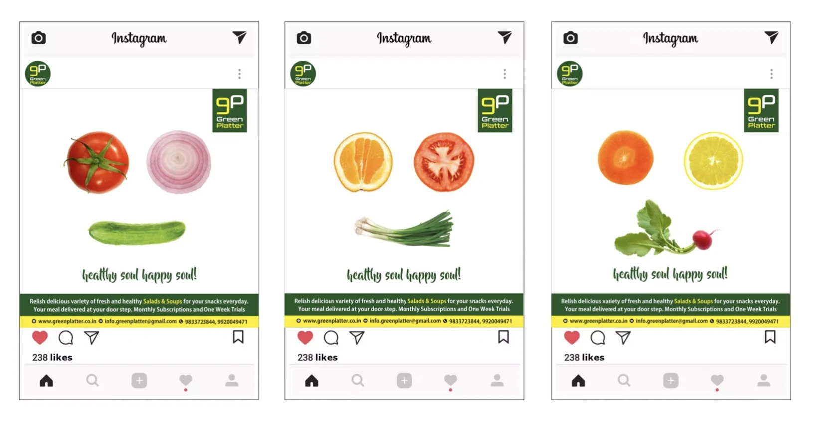
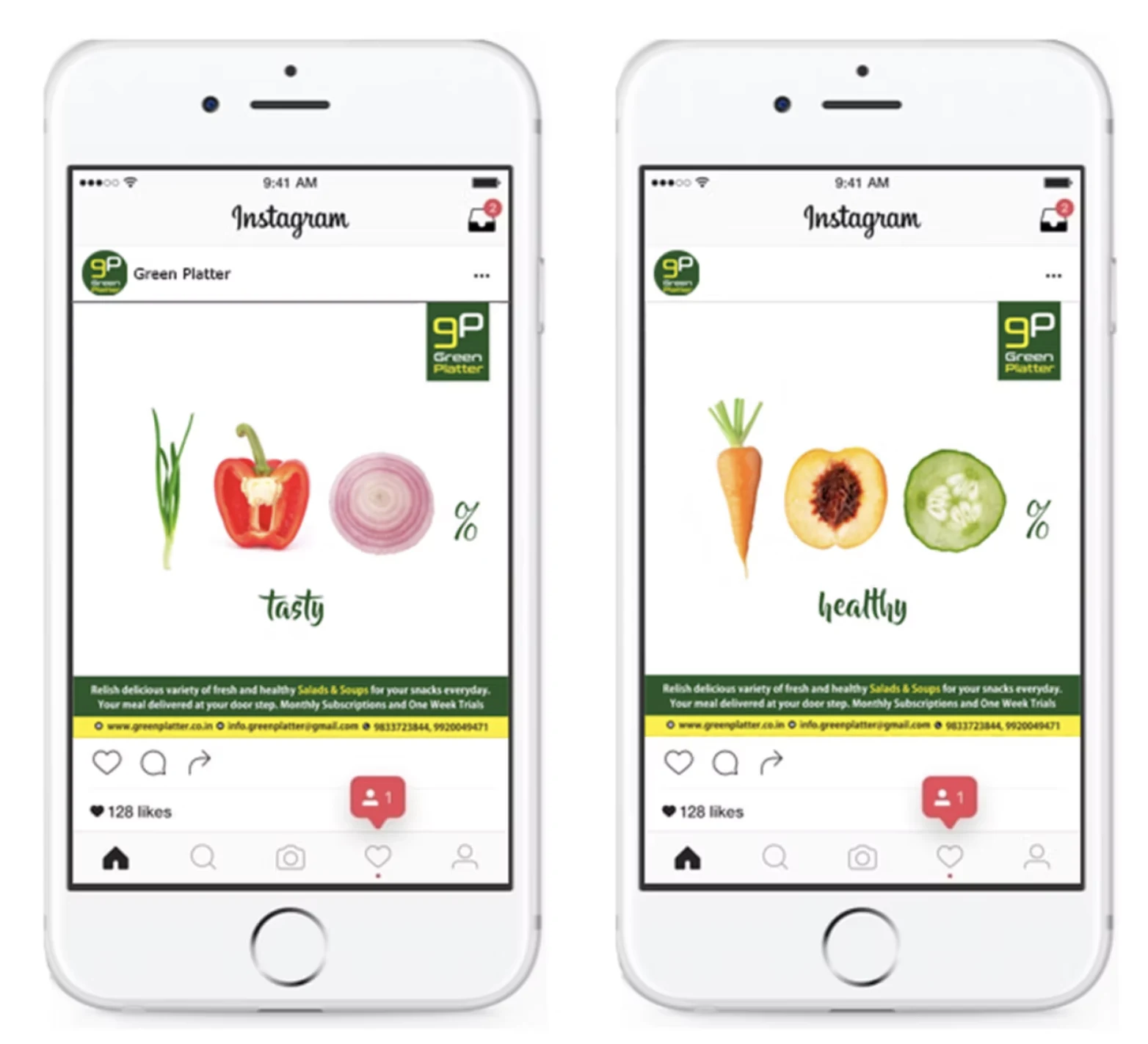
The concept reframes nutrition as a support system: reduce planning effort, make recommendations relevant, and build motivation into the experience.
Healthy intent breaks down when every meal requires research and calculation.
Automated, goal-aware planningToo many decisions create choice fatigue before the customer even orders.
Curated choices and scheduled deliveryManual logging can make healthy behavior feel like administrative work.
Visible nutrition with passive progress cuesHealth objective and desired routine
Diet, schedule, preferences, and exclusions
Relevant meals and balanced recommendations
A clear, actionable meal schedule
Progress mechanics support the core job rather than becoming a separate rewards layer.
Recommendations, nutrition context, and delivery planning reduce effort.
Streaks and milestone cues can reinforce habits without judgment.
Peer ideas, reviews, and shared milestones create social encouragement.
The identity, packaging, product, and campaign all communicate fresh simplicity.
The screens supplied describe a strategic product concept. Adoption, retention, time-saved, and testimonial claims should only be published when supported by source data.
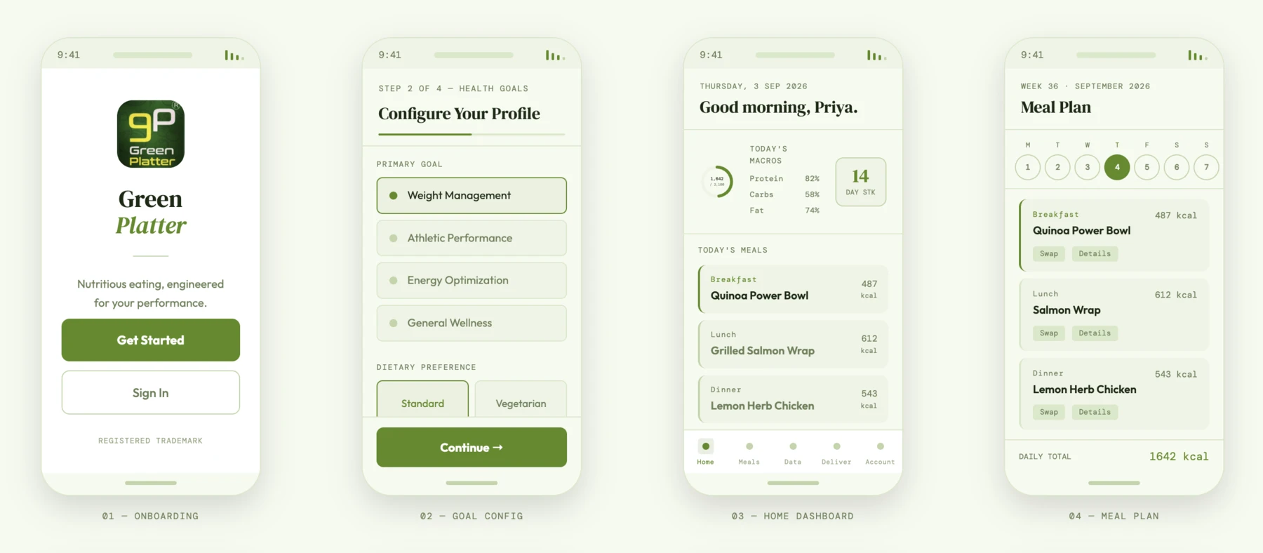
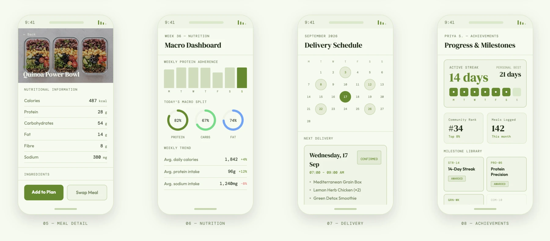
The product flow reduces effort while keeping nutrition, preference, and progress visible.
The interface translates the strategy into a connected journey across goal configuration, daily planning, nutrition, delivery, and milestones.
Dark-theme studies demonstrate that hierarchy, state, and interaction patterns remain consistent when the visual expression changes.
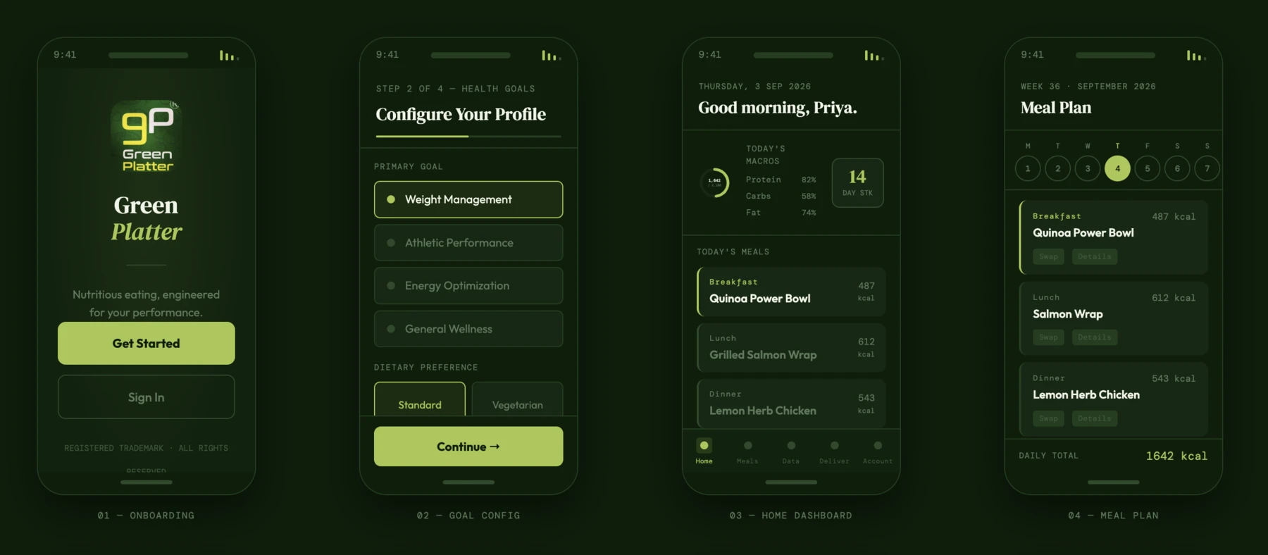
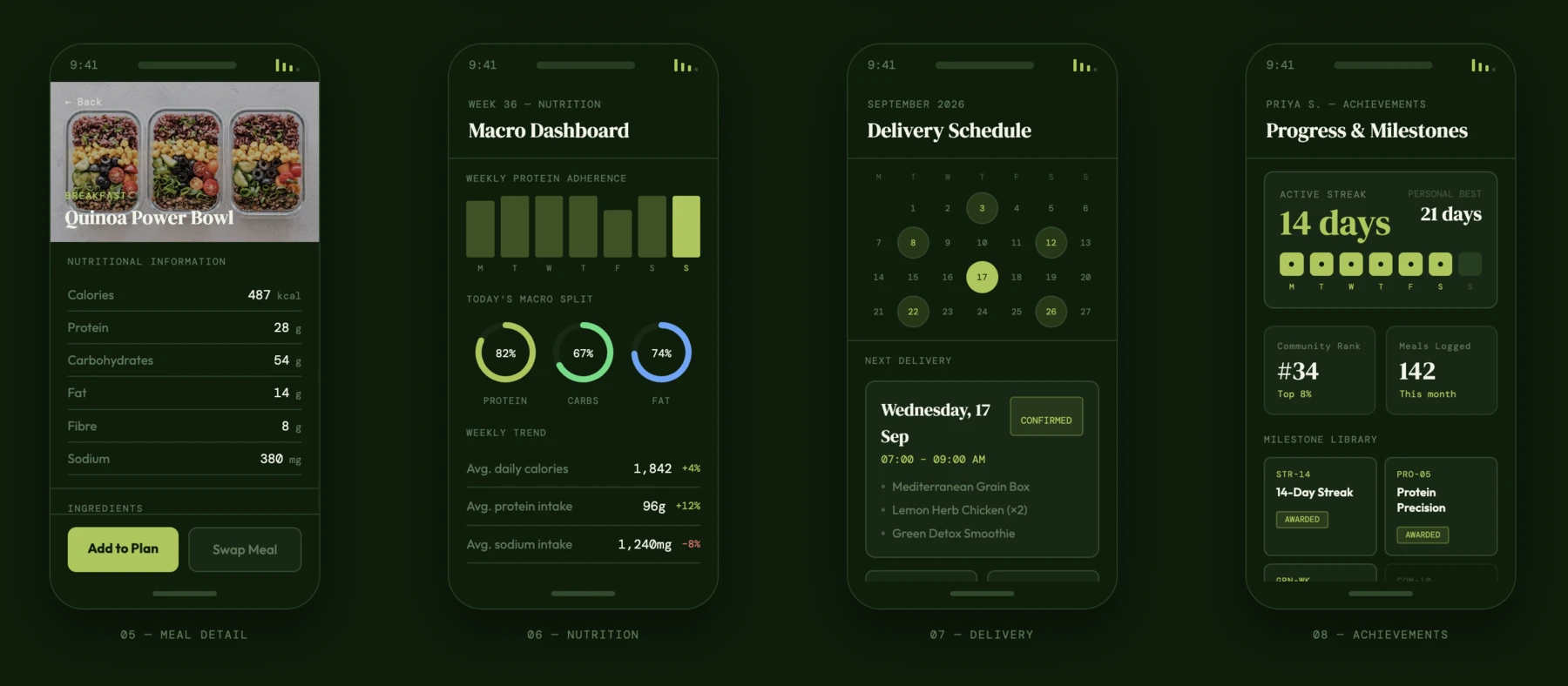
These are high-fidelity product-concept screens. Names, meals, streaks, nutrition values, and progress metrics shown in the interfaces are illustrative.
I treat interfaces as visible expressions of a deeper system: user intent, information structure, operating constraints, evidence, and brand promise.

I’m a UX and product design professional with 18+ years across digital experience, visual communication, product design, and design leadership.
My strength is connecting insight to execution—shaping experience vision, defining journeys and interaction models, and translating strategy into prototypes, high-fidelity UI, reusable patterns, and implementation-ready specifications.
UX Certification · User Experience Design
Advanced specialization in UX Management, Product Strategy, Qualitative Research Architecture, and Strategic Metrics Frameworks.
B.F.A. (Applied Art) · Advertising & Visual Communication
Gold Medalist · 8 Government and State Awards
Reflections on enterprise UX, qualitative research, design leadership, and an evolving product-strategy practice.
Why simplicity in enterprise products is not about removing information, but making complex systems understandable without concealing their reality.
Read article →Meaningful qualitative research begins with the architecture of the study—before interviews, observations, and conversations take place.
Read article →A perspective on guiding product, engineering, business, compliance, and user priorities toward a shared experience direction.
Read article →A reflection on returning to formal study—not to start over, but to better understand and strengthen years of multidisciplinary design experience.
Read article →I’m interested in product strategy, experience architecture, and design-system challenges where clearer structure can change what a team builds and how people use it.
aneeshawatve3@gmail.com


